Overview
Overview
Overview
Overview
Catch is an AI-driven disease prevention platform created by the cofounders of Thrive Market.
I joined as the first full-time product designer after an early MVP struggled with low engagement and unclear user sentiment. I led a full redesign across the website, product, onboarding, and spearheaded biomarker integration and design. I worked directly with founders and medical advisors to integrate predictive risk modeling into a cohesive, scalable experience.
I transformed a fragmented MVP into an investor-ready platform with a clear product architecture and preventative health narrative.
Finding the pain points
Finding the pain points
When I first joined, conversion rates on the landing page were struggling and engagement with the product was low. I created a user interview program both with users who converted and others who engaged with the site but did not sign up. Several patterns emerged through these discussions:
Complex Clinical Data → Consumer Clarity
Biomarkers, cancer risk scoring, and AI-driven predictions are inherently complex. The experience needed to translate clinical rigor into intuitive, actionable insights.Trust & Credibility Gaps
Users were asked to share deeply personal health data, yet the product lacked clear signals of privacy, legitimacy, and scientific authority.Sterile, Clinical Experience
The interface felt cold and overly medical. This reduced emotional resonance and long-term motivation for preventative behavior change.Investor-Ready Vision
Catch required a cohesive, high-fidelity product narrative that could support fundraising and healthcare partnerships.
After presenting these insights to the team, I reccomended creating a new design system, onboarding flow, and moving up biomarker integration on the roadmap.

Refreshing the Design System & Lead funnel
Refreshing the Design System & Lead funnel
Led a complete redesign of Catch’s design system and marketing website to replace a sterile, clinical aesthetic with a trust-forward, modern health-tech brand.
Created and maintained a new design system
Clarified the core value proposition — translating complex biomarker science into a simple narrative around risk awareness and prevention.
Reworked the homepage hierarchy to emphasize credibility signals, scientific backing, and clear calls to action.
Redesigned the onboarding entry points to reduce friction and improve conversion into the risk assessment flow.
Aligned the visual language of the website and product to create a cohesive end-to-end experience from acquisition through engagement.
This resulted in a more than doubling of Catch's conversion rate.


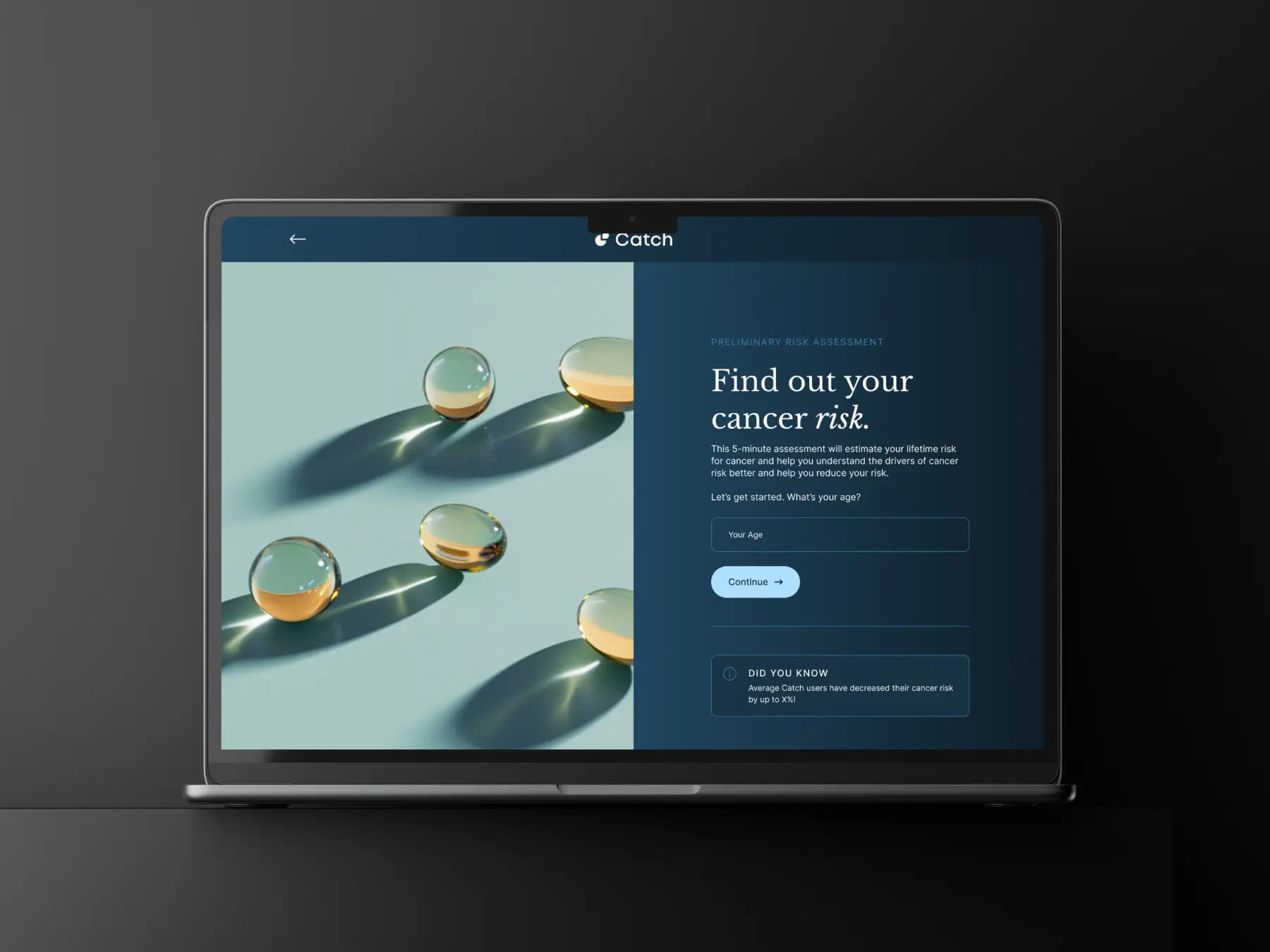
Making Risk Assessment More Accessible & Less Scary
Making Risk Assessment More Accessible & Less Scary
Redesigned the end-to-end risk assessment flow to translate 500+ risk factors and biomarker inputs into a clear, guided experience.
Simplified complex health questions into structured, progressive steps to reduce overwhelm and drop-off.
Balanced data collection with reassurance — reinforcing privacy, scientific credibility, and why each input mattered.
Introduced visual risk scoring that made outputs understandable without exposing raw clinical complexity.
Integrated assessment outputs directly into personalized action plans, creating a seamless bridge from insight to behavior change.
Resulted in a 14% improvement in completion rate in Amplitutde.
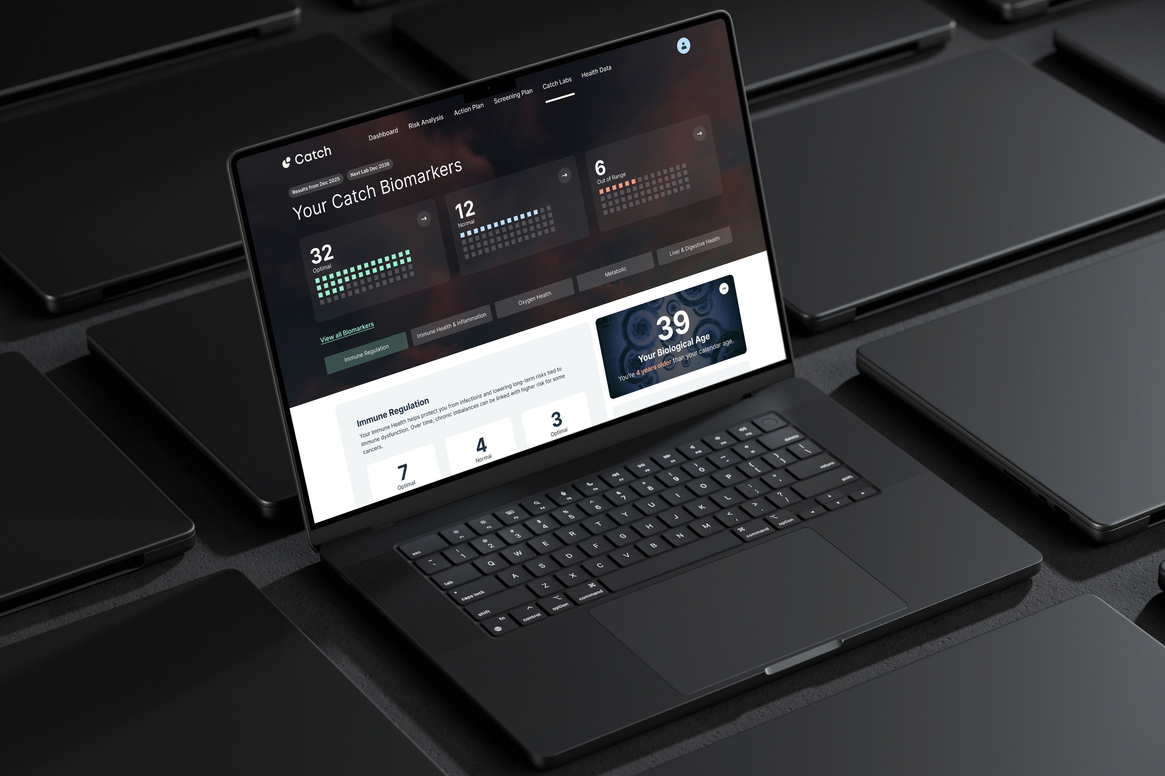
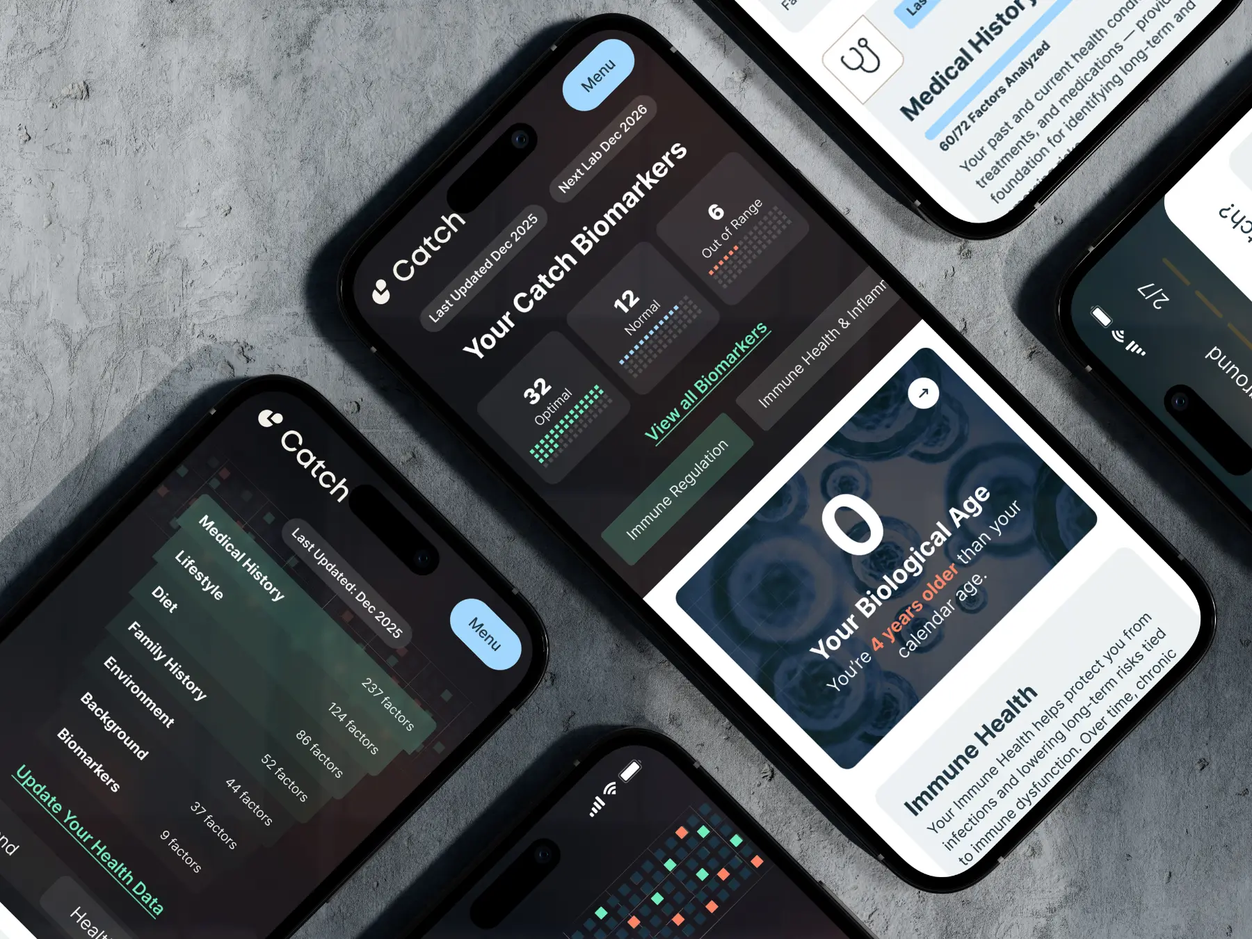
Designing the Biomarker System & Dashboard Architecture
Designing the Biomarker System & Dashboard Architecture
Led the 0→1 design of Catch’s biomarker experience and dashboard architecture, translating longitudinal lab data into clear, actionable health signals.
Defined biomarker classification logic (out-of-range, in-range, optimal) in partnership with clinical and engineering teams, integrating it into the predictive risk model.
Designed the dashboard information hierarchy to prioritize what changed, why it matters, and what action to take — reducing cognitive load and improving trust.
Created a cubic visualization system to communicate biomarker status and trend direction without requiring users to interpret dense charts or raw lab tables.
Collaborated closely with engineering to align data modeling, thresholds, and asynchronous lab updates with the user experience.
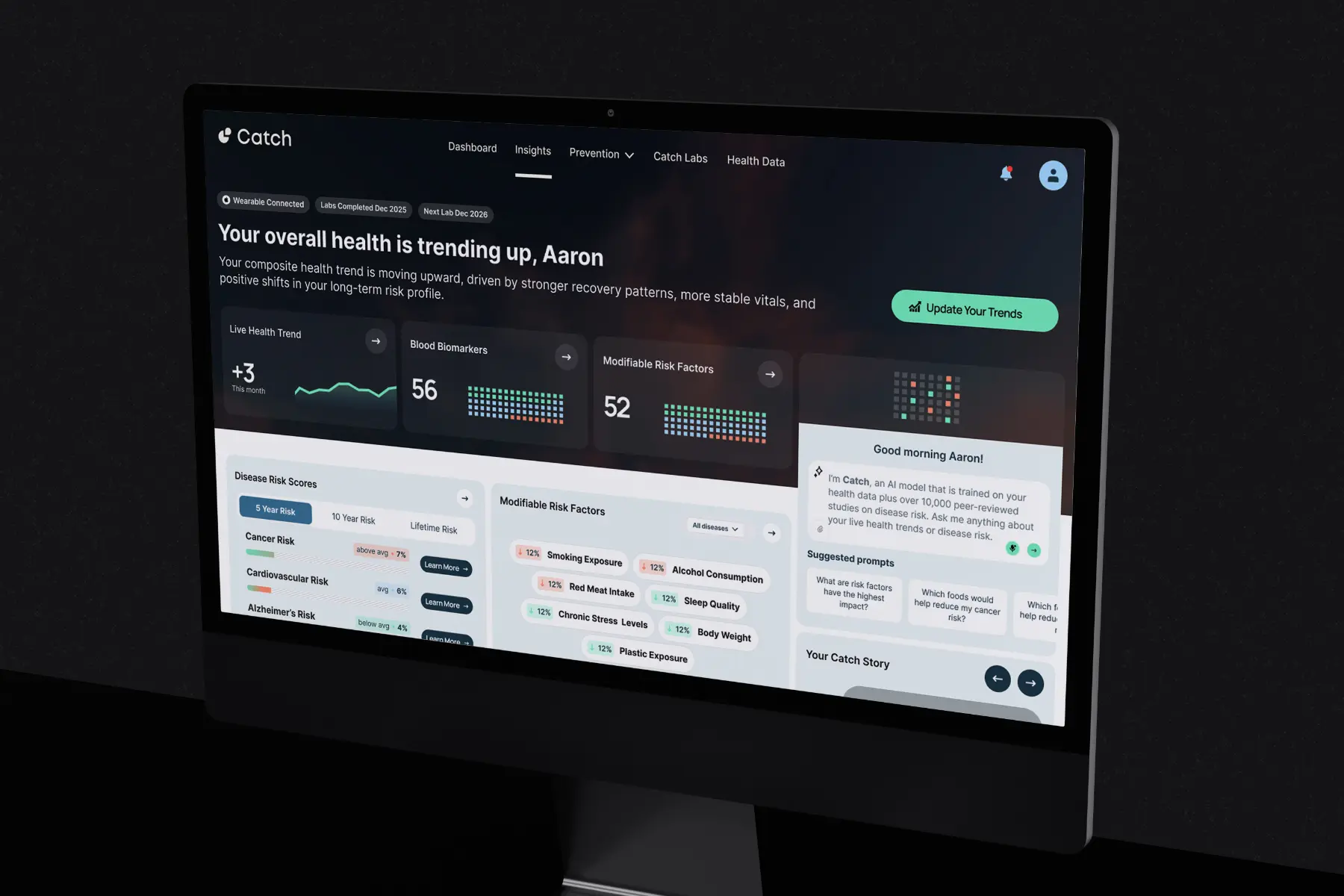
The Results
The Results
3x Increase in Landing Page Conversion – Improved conversion rate from 0.6% to over 2% by redesigning the brand, clarifying the value proposition, and optimizing the lead funnel into the risk assessment flow.
14% Increase in Risk Assessment Completion – Reworked onboarding and dashboard information hierarchy to reduce friction and cognitive load, driving higher completion rates.
Stronger Product Clarity & Trust – Simplified complex biomarker data into intuitive health signals, increasing engagement with core features and recommended actions.
Investor-Ready Platform – Delivered a cohesive, high-fidelity experience used in fundraising and strategic conversations.